08 Jul How to use Information Design Principles for Better eLearning
When designing eLearning content, what we are really talking about, is a discipline called information design. Information design takes inspiration from other fields of study such as art, graphic design, education, and even architecture and engineering.
You will see information design in many aspects of day to day life, from documentation to magazines, from school books to signage and from packaging to websites.
But what exactly is information design?
The Information Design Association describes it as ‘the skill and practice of presenting information so that people can use it efficiently and effectively’. This means we must focus on the learner first and foremost. It is less about presenting something nicely for the learner to look at, and more about providing clear, concise communication to ensure the learner does not have to work hard to understand.
So how can we achieve this when designing our eLearning projects?
Like many things, the answer can be found in our psychology. As humans, there are several non-verbal cues that our brains naturally prefer to see in the visual media we come across. Usually, we will spot if something is wrong in eLearning design before we notice something that works well. If a visual element of an eLearning course does not follow our natural preferences, it will most likely stand out and may even produce an uncomfortable experience or cause a barrier to learning. All of which we hope to avoid when designing for eLearning!
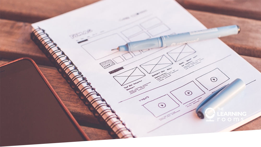
Let’s take a look at some information design principles in more detail so that you can take advantage of them when developing your next eLearning project.
Proximity
The principle of proximity refers to design elements and their relationship with one another. When aspects of a design such as text, shapes and photos are placed far away from each other, the learner may think, even if it is not intended, that they are disconnected. Typically elements that are placed closely will be perceived as being similar or connected.
Figure & Ground
Figure and ground is concerned with how we perceive objects as being separate to their background. When designing eLearning, we should make it easy for the learner to mentally separate background and foreground of an image or design. This can be achieved by using appropriate contrast. Think about reading your favourite book and how black text (figure) is easily read on a contrasting white page (ground). If sufficient contrast is disregarded or not used properly, the learner’s experience will be impacted and they may perceive the message incorrectly.
Closure
Naturally we like to identify patterns in the information we are presented with. If there are gaps in shapes or text for example, our eyes and minds will work to close those gaps so that we can perceive them as solid, in order to understand them. When designing for eLearning, you may like to consider this principle and favour more complete and whole shapes in your design.
Continuation
The human eye tends to follow lines and curves to establish links between design elements. This is why you will usually see that a menu on a website or in eLearning, will remain in the same place no matter where the user navigates to on the site or course. By using this principle, you will be creating a sense of continuity and connection for the learner to positively impact their experience.
Similarity
Good information design makes use of visual hints that arranges connected objects and separates unrelated information. The principle of similarity relates to how figures and shapes that have similar qualities (e.g. colour, shape, size) will be perceived as being connected. This is why it is always a great idea to keep items like links, buttons, text size and colour consistent in their design so that the learner recognises them as we intend.
To learn more about information design and how you can apply these principles to create better eLearning, we recommend reading the Non-Designer’s Design Book, 4th Edition, by Robin Williams. Or to make eLearning design even easier, why not check out our re-usable eLearning template. Our years of experience in building engaging and interactive eLearning courses have enabled us to develop an Articulate Storyline Template designed to empower you to develop consistent, highly interactive eLearning.