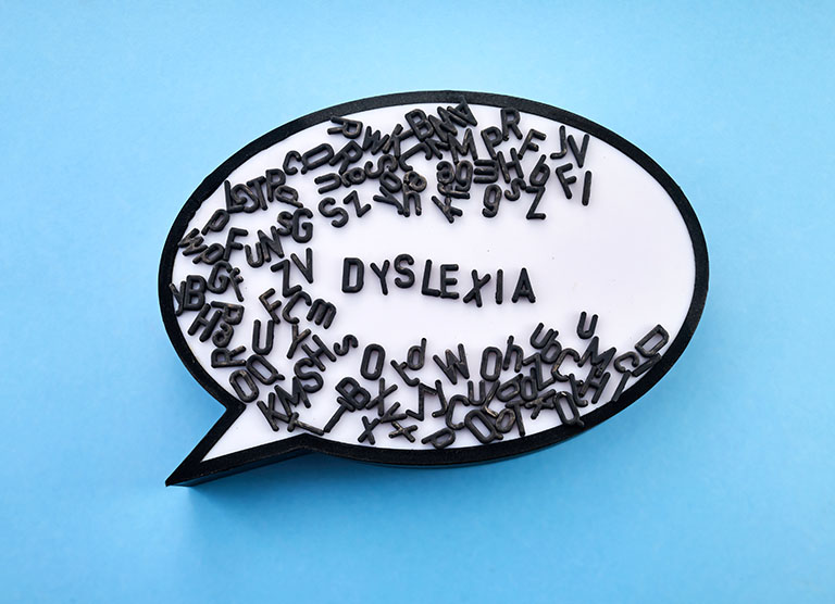
Designing eLearning for neurodiversity
In this blog, we will learn how to better design eLearning to make it more accessible to people with dyslexia.
What is dyslexia?
Dyslexia is considered a learning difference that impacts a person’s ability to read, write and spell. Dyslexia can occur on a spectrum with some people experiencing mild dyslexia and others more severe. Every person with dyslexia is different and dyslexia does not reflect a person’s intelligence. It is estimated that 1 in 10 people have dyslexia globally.
People with dyslexia have an abundance of talents and strengths and each person is different. Many famous accomplished people throughout history are reported to have had dyslexia including Steve Jobs, Henry Ford, Agatha Christie, Jamie Oliver, Pablo Picasso and even Albert Einstein (Dyslexia Association of Ireland).
Dyslexia is a recognised disability under Irish and EU law. Accessible and inclusive eLearning must cater to everyone, including people with dyslexia. So let’s learn how with 5 tips on designing eLearning for dyslexia.
5 tips on designing eLearning for dyslexia
- Simplify the text content. Write short simple sentences (15-20 words per sentence on average). Avoid jargon, acronyms and overly complex vocabulary. Provide a glossary of terms if needed.
- Check the visual presentation of your content. Left-align text and use at least 1.15 line spacing between lines of text, or 1.5 if possible. Keep wide margins. Organise text into short paragraphs and use bulleted lists where possible. Use headings, subheadings and paragraphs consistently. Avoid underlining text, instead, bold the text, use colour or a text box to highlight important information.
- Choose the right typography. A sans-serif font, such as Arial, Calibri or Verdana is easier to read. Your font size should be a minimum of 12pt or 14pt. Another way to improve readability is to increase the spacing between letters in text —according to research this has the most impact for improving reading speed.
- Check the colours and backgrounds. Black text on a stark white background can be difficult to read for some people. It is recommended to use a dark font colour (grey) on a light (not white) background. Avoid backgrounds with patterns or images. Instead, use a simple, single-colour background, such as off-white, cream or light pastel colours, making sure that there is still enough contrast between the background and text colours.
- Make it compatible with assistive technology. Ensure your eLearning is designed to be compatible with text-to-speech software and screen readers, as well as other forms of assistive technology. Avoid putting text content into images. Include text transcripts for video. Consider Universal Design for Learning (UDL) principles and offer choice and variety in how content is delivered, ensuring a mix of text, video or animation and audio.
Here at The Learning Rooms, we design our eLearning to be accessible and inclusive. That means for everyone.
This is part of a blog series on neurodiversity:
- Embracing neurodiversity in the workplace
- Designing eLearning for neurodiversity: 9 tips
- Designing eLearning for dyslexia
- Designing eLearning for ADHD
- Designing eLearning for ASD
- Designing eLearning for dyspraxia


